· blog · 4 min read
Build a Custom Autodesk Viewer Extension with React
In this post, we'll dive into the technical nitty-gritty of integrating a React component into an Autodesk Viewer extension. We'll cover the basics of creating a simple Viewer Extension embedding a React component.

Introduction
Our mission at Innotek is always to create solutions built to last and scale. We do this by using tech with a proven track record already familiar to many developers, so you’ll never have to worry about scaling your team as your company grows.
This is how we started experimenting with the idea of building Autodesk Extensions that leverage the power of React. React is a popular library for creating front-end applications from Facebook and the React community, which has been around for ten years. It’s an excellent choice for building user interfaces because it’s declarative, component-based, and easy to learn.
Getting Started with Custom Extensions
Before we integrate React with Autodesk Viewer, we must familiarize ourselves with adding a custom toolbar extension to the Autodesk Viewer. Our extension will consist of a button that, when clicked, will open a panel containing our React component. Here’s a detailed guide on adding a Custom Toolbar in Autodesk’s documentation, which we highly recommend: Autodesk Viewer Toolbar Button Customization reading.
1. Custom Extension Overview
Here’s a quick overview of the functions that we will implement in our extension:
/**
 * This function appends a new button to the Autodesk Viewer toolbar.
 * When clicked it opens a new panel containing our React component.
 */
CustomToolbarExtension.prototype.createUI = function () {};

/**
 * Events that run during the extension's lifecycle.
 */
CustomToolbarExtension.prototype.load = function () {};
CustomToolbarExtension.prototype.onToolbarCreated = function () {};
CustomToolbarExtension.prototype.unload = function () {};
2. Initializing the Custom Toolbar Button
The top three functions load, onToolbarCreated, and unload ensure the createUI runs only when the viewer is ready. We won’t dive into implementing these functions here, but we use a similar approach to what you’ll see in the official Autodesk Viewer Toolbar Button Customization. For the full implementation, please check out our GitHub repo.
What’s specific to our extension is the createUI function:
CustomToolbarExtension.prototype.createUI = function () {
  var viewer = this.viewer;

  var button = new Autodesk.Viewing.UI.Button("my-view-back-button");
  button.onClick = toggleCustomReactPanel(viewer);
  button.setToolTip("Show React Property Window");
  button.icon.classList.add("fa-brands", "fa-react", "fa-lg");

  // SubToolbar
  this.subToolbar = new Autodesk.Viewing.UI.ControlGroup(
    "my-custom-view-toolbar",
  );
  this.subToolbar.addControl(button);

  viewer.toolbar.addControl(this.subToolbar);
};
Initializing a new Docking Panel
You may have noticed in the above code that when we click the custom button, it calls toggleCustomReactPanel.
This function will create the Docking Panel that will be the container for our React component. We use the Autodesk.Viewing.UI.DockingPanel class to initialize a new Docking Panel:
function toggleCustomReactPanel(
  button: Autodesk.Viewing.UI.Button,
  viewer: Autodesk.Viewing.GuiViewer3D,
) {
  const customPropertyPanel = new Autodesk.Viewing.UI.DockingPanel(
    document.querySelector(".adsk-viewing-viewer")!,
    "customPropertyPanel-react",
    "React Panel",
  );
  customPropertyPanel.setVisible(true);

  const reactContainer = document.createElement("div");
  reactContainer.id = "customPropertyPanel-react-root";
  customPropertyPanel.container.appendChild(reactContainer);

  const container = document.getElementById("customPropertyPanel-react-root");
  const root = createRoot(container!);
  root.render(<CustomPropertyPanel viewer={viewer} />);
}
Initializing the React Component
Next, let’s implement the CustomPropertyPanel component. This will render inside the Docking Panel and can serve as an entry point for your React application. For the start, we will render a simple form with a text area and a checkbox:
import { useState } from "react";
export default function CustomPropertyPanel() {
const [notes, setNotes] = useState<string>("");
return (
<div className="px-[13px]">
<form>
<div className="flex flex-col justify-between gap-4">
<label htmlFor="notes">
Notes
<textarea
className="form-control mt-1 block text-default"
value={notes}
onChange={(e) => setNotes(e.target.value)}
/>
</label>
<label htmlFor="verified">
Verified
<input type="checkbox" className="form-control mt-1 block" />
</label>
</div>
</form>
</div>
);
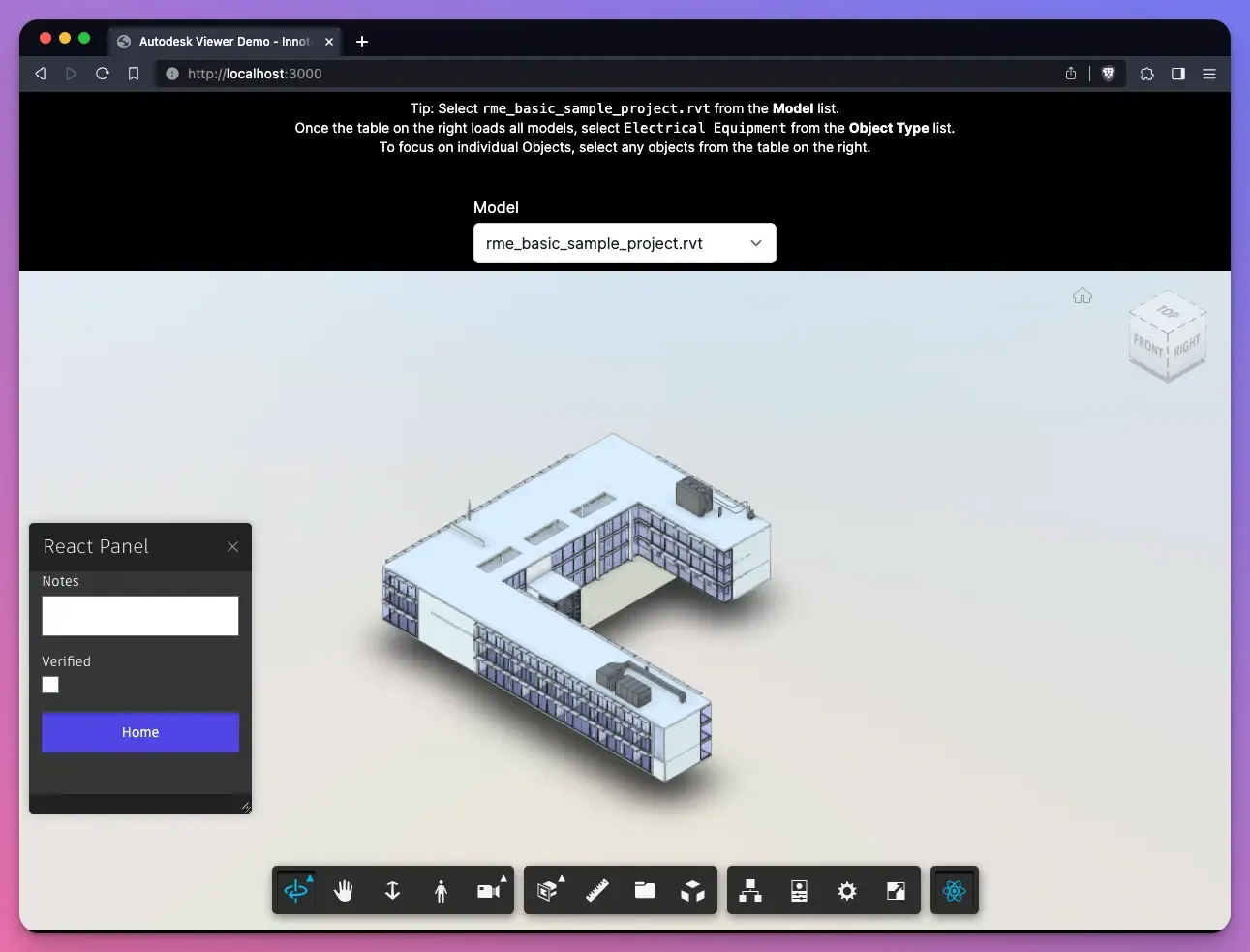
}Here’s how the panel looks like with the Autodesk Viewer running and after clicking the Custom button we created earlier:
Interacting with the Viewer Instance from a React Component
Finally, to leverage the full power of this integration, we pass the viewer instance to the React component. Inside the React component, we can interact directly with the Viewer and trigger viewer actions based on events like button clicks.
In our example, we added a Home button that resets the viewer’s camera to the original state and removes any selection.
Here’s how we implemented this without the parts that we already covered, such as the input fields:
type CustomPropertyPanelProps = {
  viewer: Autodesk.Viewing.GuiViewer3D;
};

export default function CustomPropertyPanel({
  viewer,
}: CustomPropertyPanelProps) {

  function handleClick() {
    viewer.clearSelection();
    viewer.isolate([], viewer.model);
    viewer.navigation.setRequestHomeView(true);
  }

  return (
    <div className="px-[13px]">
      <form>
        <div className="flex flex-col justify-between gap-4">
          {/* Same as before */}
          <button
            type="button"
            className="home-button form-control mt-1 block bg-indigo-600 px-3.5 py-2.5"
            onClick={handleClick}
          >
            Home
          </button>
        </div>
      </form>
    </div>
  );
}
This setup enables a seamless and interactive flow between the React Component and the Autodesk Viewer, unlocking many possibilities for enhancing user experience and functionality.
In conclusion, following these steps can effectively integrate React components into Autodesk Viewer, creating a more interactive and tailored user experience. This approach not only leverages the strengths of React’s capabilities but also adds a layer of customization and flexibility to the powerful Autodesk Viewer platform.
Stay tuned for more insights and tips on leveraging cutting-edge technologies to enhance your development projects. And remember, at Innotek, we’re always here to help you innovate and scale efficiently.
Further Learning:
Here are some resources for a deeper dive: